
Work Instructions
7 min read

A technician is asked to write instructions for his company’s most frequently performed processes. Pulling out his laptop, he starts to document a procedure as he does it. He spends hours going back and forth between the procedure and his computer, writing down every step. Occasionally, he’ll stop to take a photo or sketch a diagram of the more complicated steps. But even though all the directions are correct, our technician made a critical error—before he even started writing down the steps.
Technical documentation—whether work instructions, training manuals, or product guides—is essential to any workforce. Technical documentation aims to standardize procedures, ensure efficiency, and outline safety information.
Despite these good intentions, technical documentation—as written in scenarios like the one above—just can’t meet the needs of today’s multimedia user. Whether experienced technicians or novice customers are using your technical documentation, a “text-first” approach is overused and outdated. It’s not engaging and it’s not effective.
It’s time to rethink how we create technical documentation.
Let's begin where most of us end: with visuals.
The Importance of Visuals
Companies traditionally create technical documents with a text-first approach—writing a couple chunky paragraphs, adding handfuls of bullet points, and (if it’s convenient) throwing in a few visuals, like photographs or diagrams. Yes, for years the text-first approach made sense.
For one, technical documentation was commonly built in applications that encouraged prioritizing text, like Microsoft Word or PowerPoint. (When you open up a Word Document, you get a blinking cursor—not a media uploader.) And before the advent of dSLR cameras and sophisticated camera phones, photographs weren’t easy to incorporate into technical documentation. (It certainly isn’t cost-effective to print pages filled with colorful images.)
So it’s not that authors can't put visuals in technical documentation—they have just been conditioned not to.
But times have changed, and so should the documentation. Now, there are visual-first applications available, like Dozuki—the leader in work instruction software. Now, good cameras are affordable to own and easy to use. Now, mobile electronics—like smart phones, tablets, and laptops—are on every desk and in every pocket. And those devices can replace the bulky, disorganized documentation binders we’ve all grown accustomed to.
We simply can’t ignore visuals anymore. Because a visuals-first approach isn’t just a more viable option, it’s the only option. To make documentation for the modern user, we’ve got to take into account how they learn. Today’s technical documentation users process information far better when it’s communicated visually. 90% of all information processed in the brain is visual—which means users will always gravitate to photographs and diagrams.
Visuals are processed 60,000x faster than text—which means users will understand your content much more efficiently. When visiting a website, the average person only reads 20% of the copy, hunting and skimming for key information and visuals. Prioritizing text just doesn’t cut it for the modern reader.
Visuals First, Text Second
So simply adding more visuals will improve your technical documentation? Not quite. You have to create your visuals first. Why? The processes in technical documentation are rarely simple—and you don’t want the success of your documents to be threatened by text with problematic jargon or contextual misinterpretations. Stop relying on text as the sole vehicle of meaning.
Instead, make your visuals powerful enough to stand on their own. But to do that, the visuals need to come first. Photographs, for example, bring necessary context to a step and literally show users what they should be doing.
Even with photos, if you write your text first, you’re more likely to rely on that text to make up for any deficiencies in your photos—in effect, treating the visuals as an afterthought.
When it comes to technical communication, your photos should do the heavy lifting. By taking your photos first, the pressure is on for them to be so good that you could communicate your entire procedure with just those visuals. It’s a strategy that will eliminate concerns for even novice or ESL users.
Not All Visuals are Created Equal
There is one hitch with visuals: they aren’t created equal. Some companies take on the visual-first approach, but fall into several common pitfalls.
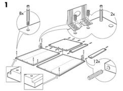
For instance, many of us are familiar with Ikea’s notoriously frustrating visual instructions. This Ikea diagram, for example, is certainly visual—but it’s not helpful. The context isn’t clear, the parts aren’t labeled effectively, and it suggests nearly ten tasks at once.
Users aren’t even sure what the object is—not a great sign. This diagram is just as bad, if not worse, than confusing blocks of paragraphs.
So what kind of visuals should you aim for? Ones that are clean, clear, and comprehensive. Your visuals need to answer questions, not draw more out.
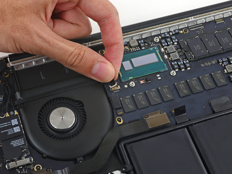
Likewise, in the photo below, a technician is detaching a delicate cable inside of a 2014 MacBook Pro. In this photo, the computer is in focus, the white background is clean, and the details of the hardware are so crisp that the image doesn’t even require markup. It’s clear what the technician is doing.
Start Visualizing Better Documentation
Visuals are more than just pictures and sketches—they are the foundation that today’s technical documentation should be built upon. From CAD files to pictures to videos, there is a multitude of visuals that you can start incorporating into your technical documentation. But to incorporate visuals successfully, you need to make them your first priority.
So what do you do now? Start researching solutions for visual-first documentation, like Dozuki. Read media-friendly resources, like The Tech Writing Handbook. And help your technical documentation help you—one visual at time.
This article was originally published in Context, the Australian Society for Technical Communication Magazine.
Topic(s):
Work Instructions


Written by Leslie Bloom
With a background in design and communications, Leslie is passionate about giving manufacturers the tools they need to boost the productivity and confidence of their frontline workforce.